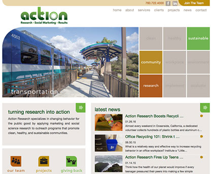
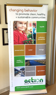
action research to launch new website > 09.14
We recently rebranded Action Research’s new website and marketing displays. AR specializes in changing human behavior through the application of traditional marketing activities blended with cutting edge research findings from the social and behavioral sciences including psychology, sociology, and economics. They promote behaviors that contribute to clean, healthy, and sustainable communities. The website uses an animated grid that highlights aspects of each area in which Action Research is involved. We designed a clean, modern look so the site is easy to navigate. The new website launched in October, 2014.
there’s a blue streak at walter andersen nursery > 06.14
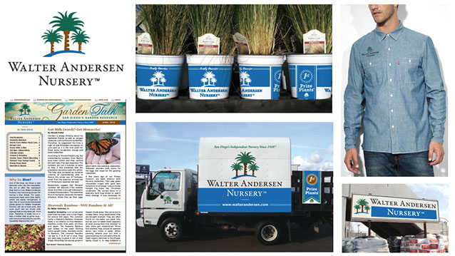
We’ve repurposed WAN’s brand by updating the color palette to include blue. The client had wanted to incorporate blue into the existing brand, so we found a blue that matched the corporate green and terracotta in the logo. From there we have been rebranding delivery trucks, signage, newsletters, website, plant containers, and much more! So over the next few months, you will start to see more blue in the stores and online.
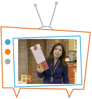
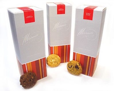
designs on the rachael ray show > 04.14
Yes, it’s a cool thing to see your work on store shelves, but to see it on TV is even better! Here, Rachael Ray highlighted these amazing cookies for which we designed the packaging as well as the website and other promotional materials. If you want to purchase some, here’s the website! www.michaelscookies.com
ty webb design brands vital therapies > 09.13
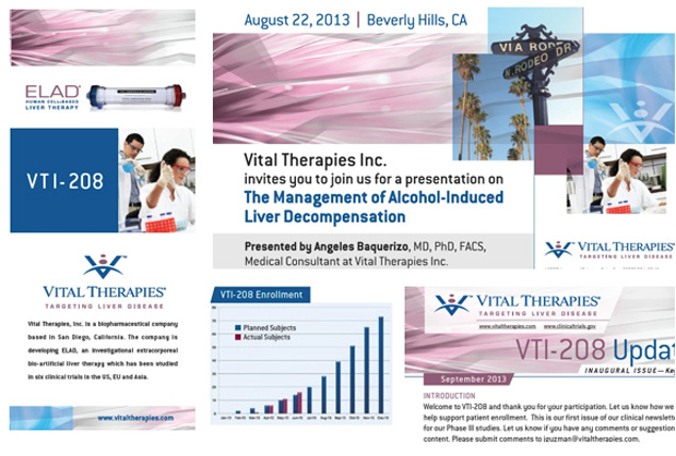
Well actually we started work back in May but the new branding is coming along nicely. Vital Therapies is a biopharmaceutical company developing a bio-artificial liver therapy. Apparently mauve is the new black! Vital Therapies had all of the materials to market themselves but needed a consistent branding message through color, typography, graphic elements and a revamping of charts, graphs and other materials.
ty webb design chosen for logo lounge annual > 08.13
It’s always cool to be recognized! With 35,000 logo submissions to LogoLounge, only 5% got selected for their Annual publication so it's definitely and honor. I would love to tell you more about this railroad company, but things are still in development. Go to LogoLounge to see more of our logos. www.logolounge.com/designer/tywebbdesign
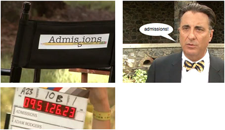
damn you tina fey! > 06.13
It was our big break...finally after all the promises to get to design a movie logo, it was happening! The logo for Admissions was on the set, the movie was in production, but then Tina Fey and Paul Rudd’s new movie, Admission, came along. Well, the name was obviously too similar so the logo was scrapped and the movie renamed. And of course, in Hollywood, everyone has a cousin that has a cousin that designs logos. Next time!

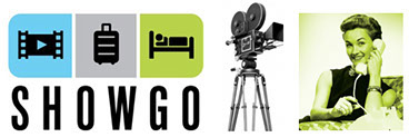
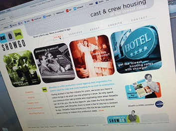
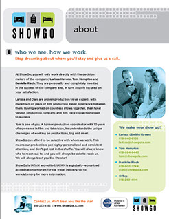
showgo launches new website > 04.13
ShowGo is a new genre of travel agency catering to film and TV productions by providing the best lodging available to cast and crew in the industry. The client wanted simple iconography and bright colors with a retro vibe. Well, ok! When it comes to “retro”, people have different ideas of what that is—old-fashioned, vintage, some think its the 80s or 70s, but it could be a 20s, 30s or 40s look. The client loved the vintage look of 1940s movies but wanted to modernize the site with a campy twist. When photography is shot in a different decade, it may look dated or campy already, which worked for this site. Add clever copywriting and a mix of modern colors and type, and there it is! www.showgola.com
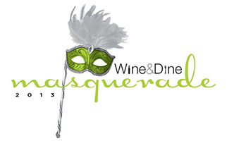
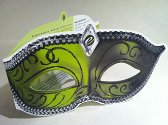
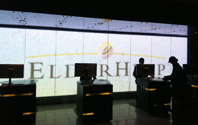
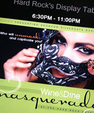
masquerade at the hard rock hotel > 03.13
This year’s fundraiser for the non-profit ElderHelp, is Masquerade at the Hard Rock. So of course we were going to incorporate a mask into the design. Die cuts can add a lot of interest to a design but should have a purpose too! With this die cut invitation, as you look through the eyes, you see the logo, theme and location of the event. Because the event is for a non-profit, we kept the invitation to 2 colors and used duotones in the logo and imagery. This festive, hip and modern event takes place at the end of April—get your tix!
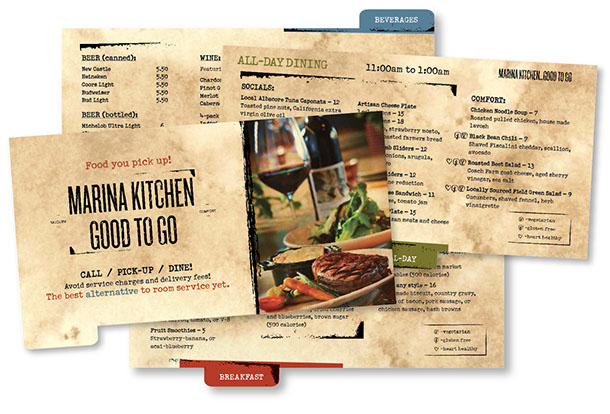
marriott marina kitchen menu > 11.12
It’s today’s room service. Local farmers with farm-fresh vegetables and locally-sourced meats. We designed an earthy, rustic and cozy menu for the comfort food that Marina Kitchen serves up so well. And what’s uniques about this room service is that you pick it up! Tabbed pages housed in a binder makes it easy to navigate. And the rustic type gives it a cozy feeling.
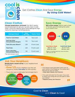
"cool is clean" campaign > 09.12
Cold water to wash all clothes? Of course! The branding for this national campaign had to appeal to and compel consumers to change their hot water usage to cold water for washing clothes. A marketing campaign includes flyers and magnets to educate consumers about environmental and monetary savings. Starting in four U.S. cities, the campaign will be introduced in more cities in the new year.
©2023 TY WEBB DESIGN | SAN DIEGO | 619 417 0403 | TY@TYWEBBDESIGN.COM