

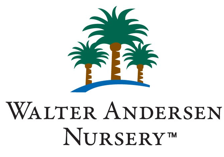
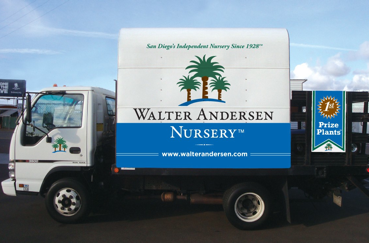
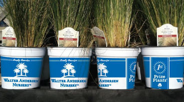
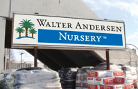
There’s A Blue Streak At Walter Andersen Nursery
06.14
We’ve repurposed WAN’s brand by updating the color palette to include blue. The client had wanted to incorporate blue into the existing brand, so we found a blue that matched the corporate green and terracotta in the logo. From there we have been rebranding delivery trucks, signage, newsletters, website, plant containers, and much more! So over the next few months, you will start to see more blue in the stores and online.
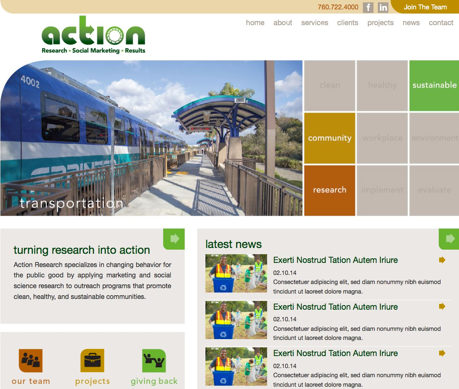
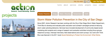
Action Research To Launch New Website
09.14
We recently rebranded Action Research’s new website. AR specializes in changing human behavior through the application of traditional marketing activities blended with cutting edge research findings from the social and behavioral sciences including psychology, sociology, and economics. They promote behaviors that contribute to clean, healthy, and sustainable communities. The website uses an animated grid that highlights aspects of each area in which Action Research is involved. We designed a clean, modern look so the site is easy to navigate. The new website launched in October, 2014.
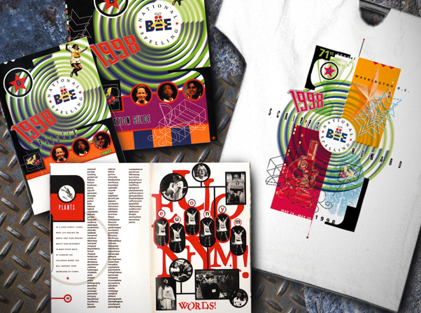
Scripps National Spelling Bee
September, 1998
They call this retro now, right? Take a trippy trip back to the 90s when Ty Webb used to work on the National Spelling Bee materials. Each year included a study guide distributed by National newspapers, guide books,
T-shirts and other promotional items. And whatever we could imagine, we usually could get away with it, as the market was geared towards kids.


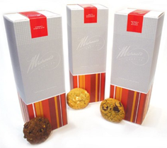


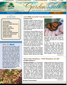
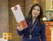
Designs On The Rachel Ray Show
02.14
Yes, it’s a cool thing to see your work on store shelves, but to see it on TV is even better! Here, Rachel Ray highlighted these amazing cookies for which we designed the packaging as well as the website and other promotional materials. If you want to purchase some, here’s the website!


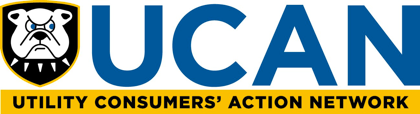
UCAN Revives + Revamps Original Logo
04.14
Utility Consumers’ Action Network (UCAN) has represented the interests of San Diego County utility customers for years. UCAN primarily focuses its efforts on the rates and services local San Diego utilities. UCAN always used a hand-drawn bulldog as its unofficial iconic image which represented strength and a watchful eye. Staff had changed over the years and the image that people remembered was lost. We revived and revamped the original drawing into a graphic icon and housed it in a shield, a form of stability and strength.

©2015 tywebbdesign.com | san diego california | 619 417 0403